
Introduction
When working with CSS, every element on a webpage is treated as a box. Understanding how these boxes work is essential for controlling layout, spacing, and positioning. In this lesson, we’ll explore the Box Model, how to size and style boxes, and how to control their visibility.
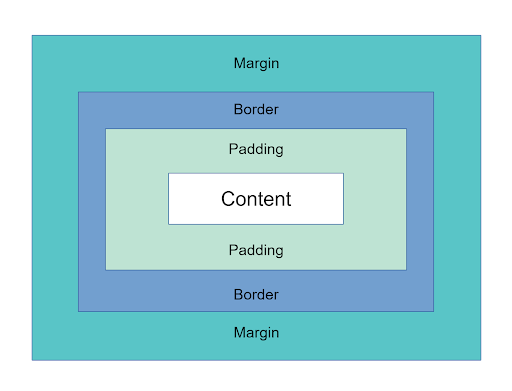
The CSS Box Model
Every HTML element is a box that consists of four key parts:
- Content – The actual text, image or other content inside the box.
- Padding – The space between the content and the border.
- Border – The edge surrounding the content and padding.
- Margin – The space outside the border that separates the box from other elements.
Visualizing the Box Model
When setting dimensions for an element, you need to consider padding, border, and margin, as they affect the total size.
By default, an element uses the content-box model, meaning width and height only apply to the content. However, if you want the width and height to include padding and borders, you would use border-box. This ensures that any padding or borders won’t add extra space beyond the specified dimensions.
Suppose you have an element with the box class and the following styles. How wide will the element be?
.box {
  border: 2px solid red;
  box-sizing: content-box;
  padding: 20px;
  width: 100px;
}
The box above would be 144px wide. The box is given a width of 100px, but since the box-sizing value is content-box, this only applies to the content itself. There will also be 20px of padding on each side, along with 2px of border on each side, totaling 144px; In order to limit the box to a total of 100px, you need only update the box-sizing value to border-box as in the example below.
.box {
  border: 2px solid red;
  box-sizing: border-box;
  padding: 20px;
  width: 100px;
}
Setting Box Dimensions
You can control an element’s width and height using the width and height properties.
.box {
    width: 300px;  /* Fixed width */
    height: 200px; /* Fixed height */
}
Min and Max Constraints
To ensure elements don’t get too large or too small, you can use min and max constraints. For example, suppose you have an element with a fixed width of 600px. If you view the page on a mobile phone that has a view width around 400px, a portion of the element will stretch beyond the width of the screen and you may have to scroll sideways to view it. To fix this, you could set a max-width of 100% on the element.
.box {
  width: 600px;
  max-width: 100%;
}
You can also set a min-height and max-height. In the example below, the height of the box is set to be 50% the height of the viewport. The height of the box will adjust based on the height of the viewport, but the element will never get taller than 800px or shorter than 400px.
.box {
  height: 50vh;
  max-height: 800px;
  min-height: 400px;
}
Handling Overflow
What happens if content inside a box exceeds its dimensions? You can use the overflow property to control this:
.box {
  overflow: hidden;   /* Cuts off content outside the box */
}
.box {
  overflow: visible;  /* Displays the content that overflows the box */
}
.box {
  overflow: scroll;   /* Adds a scrollbar */
}
.box {
  overflow: auto;     /* Adds a scrollbar only if necessary */
}
You can also control horizontal and vertical overflow separately
.box {
  overflow-x: hidden;
  overflow-y: scroll;
}
Borders: Adding and Styling Edges
Borders frame elements and can be customized using three properties: border-width, border-style, and border-color.
.box {
  border-width: 2px;
  border-style: solid;
  border-color: #FF0000;
}
Border Width Options
Define width in different ways:
border-width: 10px; /* Uniform width */
border-width: 10px 5px; /* Top/bottom and left/right */
border-width: 5px 10px 15px 20px; /* Each side individually */
Border Styles
Borders can have different styles. These include:
border-style: none;
border-style: solid;
border-style: dashed;
border-style: dotted;
border-style: double;
border-style: groove;
border-style: ridge;
border-style: inset;
border-style: outset;
Border Shorthand
Instead of defining the width, style and color properties separately, you can make use of the shorthand method. As shown below, you can use the border property with all three values together, separated by spaces.
.box {
  border: 2px solid #FF0000;
}
Rounded Corners
To create rounded corners, you can use the border-radius property. In order to create uniform corners, you can use a single value.
.box {
  border: 2px solid #FF0000;
  border-radius: 10px; /* Uniform rounding */
}
If you want to create unique shapes, you can set the rounding for each corner as seen here.
.box {
  border: 2px solid #FF0000;
  border-radius: 5px 10px 5px 10px; /* Different rounding for each corner */
}
Padding: Space Inside the Border
Padding adds space inside the border, around the content:
padding: 20px; /* Uniform padding */
padding: 20px 10px; /* Top/bottom and left/right */
padding: 10px 5px 20px 0; /* Each side individually */
You can also set padding per side:
padding-top: 30px;
padding-right: 20px;
padding-bottom: 20px;
padding-left: 5px;
Margins: Spacing Between Elements
Margins create space outside the border, separating elements:
margin: 20px; /* Uniform margin */
margin: 20px 10px; /* Top/bottom and left/right */
margin: 10px 5px 20px 0; /* Each side individually */
Similar to padding, you can set margins per side:
margin-top: 30px;
margin-right: 20px;
margin-bottom: 20px;
margin-left: 5px;
Centering a Box
To center a block element, use:
margin: auto;
If you want to control vertical spacing while centering horizontally:
margin: 10px auto;
Controlling Display of Elements
Elements can behave in different ways using the display property:
display: inline;        /* Makes a block element behave like an inline element*/
display: block;         /* Makes an inline element behave like a block element */
display: inline-block;  /* Mix of both – inline but retains block features */
display: none;          /* Hides the element completely */
To hide an element but keep its space, use:
visibility: hidden;
Box Shadows: Adding Depth
To create a shadow effect, you can use the box-shadow property:
box-shadow: 2px 2px 5px 5px #777777;
Box Shadow Breakdown
- First value: Horizontal offset
- Second value: Vertical offset
- Third value: Blur radius
- Fourth value: Spread radius
- Fifth value: Shadow color
Summary
- Every element is treated as a box in CSS.
- The box model consists of content, padding, border, and margin.
- Use box-sizing: border-box; to include padding and border in the element’s total width and height.
- Control element size with width, height, min/max-width, and min/max-height.
- Use the overflow property to handle extra content.
- Borders define edges with width, style, and color.
- Padding controls space inside the box, while margins control space outside.
- Elements can be hidden using display: none; or visibility: hidden;.
- Add shadows with box-shadow for a more dynamic look.


